
A co workspace rental company needed a logo and name card designed for their new business and they engaged me to get it done. We started with the logo design first which they mentioned that they want it to be a font based logo. They need it to be clean and simple and something that communicated the meaning behind their tagline.
I picked out this font as the letter X has two arrows pointing at each other. This, to me, symbolises coming together and connecting with each other. And making use of a location pin to replace the dot on the letter “I” to show that this is a location, a space, a co-work space.
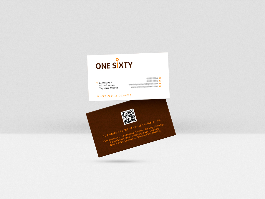
After the logo is done, I came up with this name card design which is simple clean and professional looking. The client and I decided that using brand colour to design the name card.
Do you need a new branding for your company? Contact me today for a non-obligatory quote!