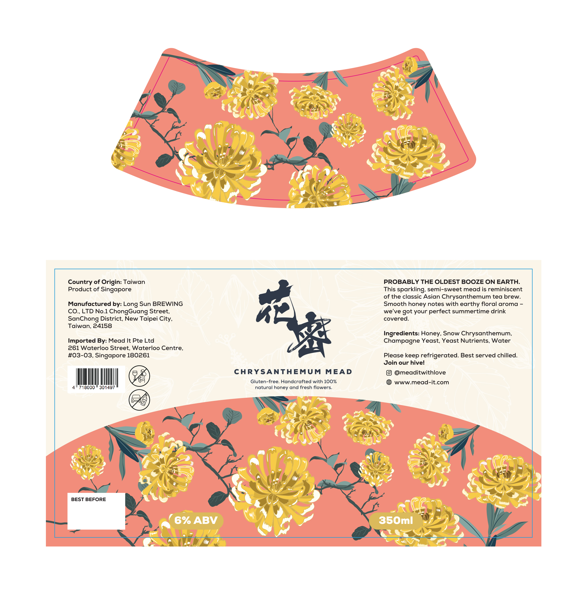
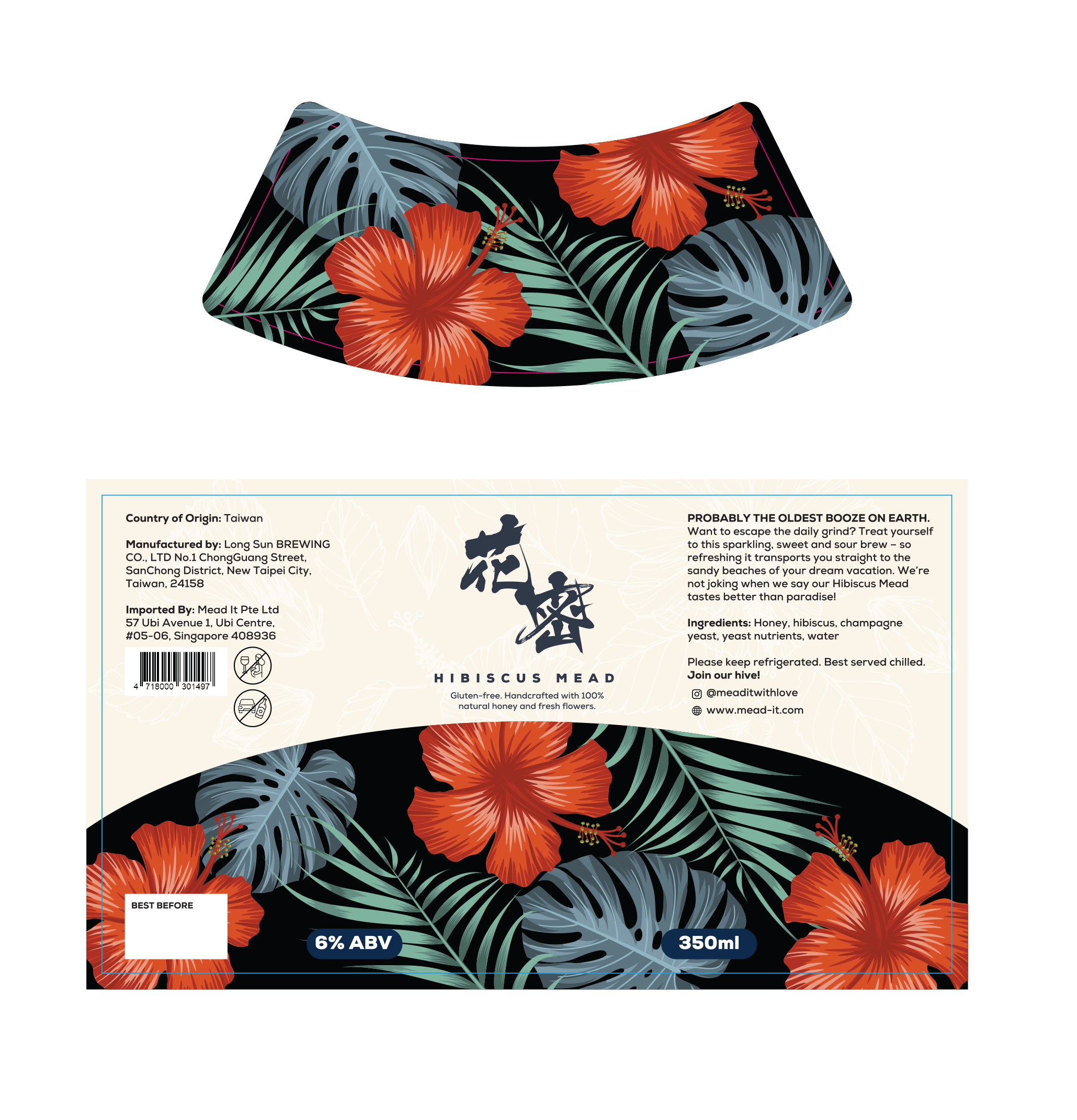
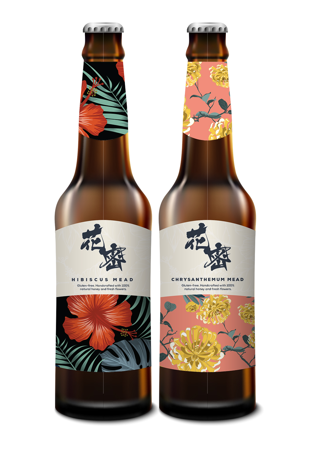
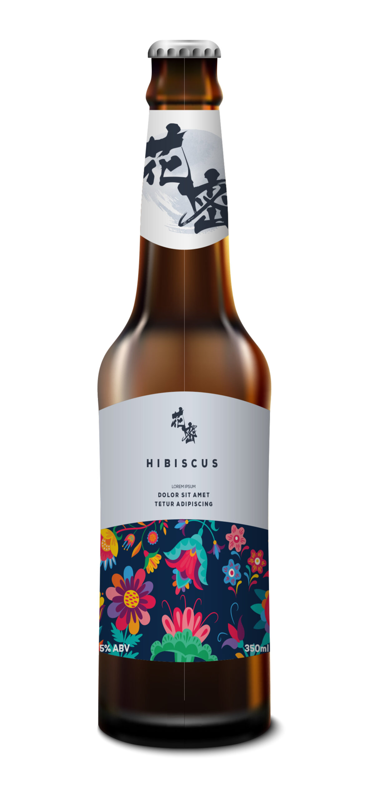
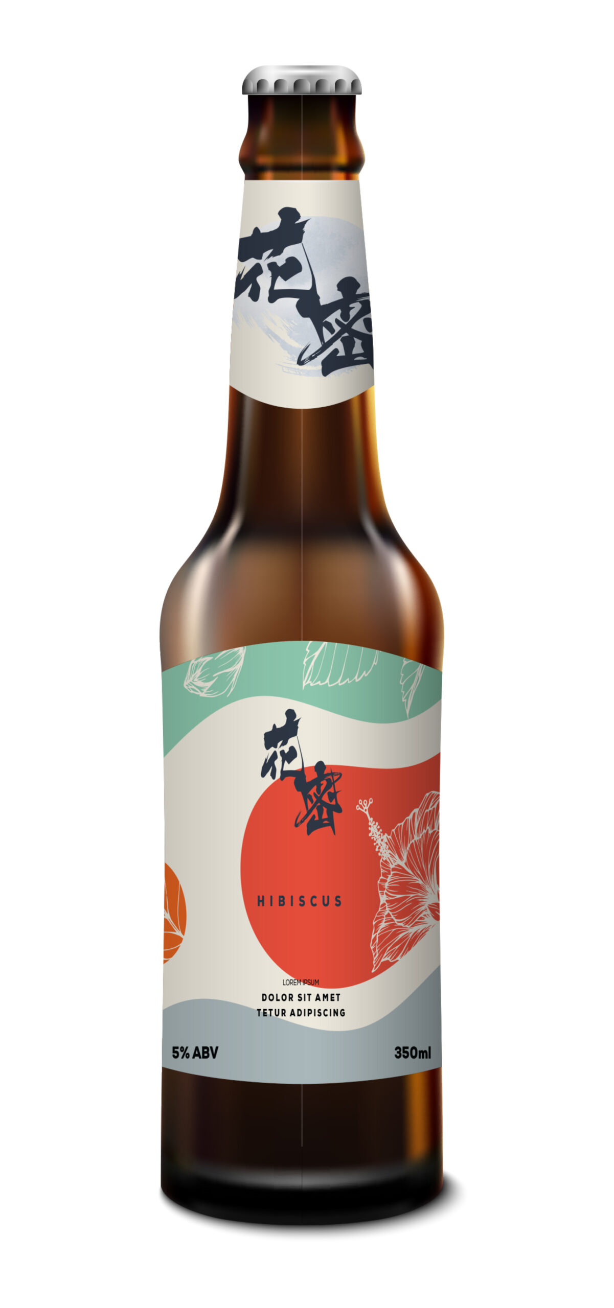
I presented 3 different sets of label design proposal to my client. Each with a different concept and feel.
First was to use colourful illustrated floral the main label design. The second mock is using smooth lines to mimic the texture of the beer and white outline of hibiscus as background. Third, I used blobs and colour blocking as the background and thought it might look colourful and attractive on the shelf.
They liked the layout from the first mock but wanted more realistic floral illustrations like what they see on mock 2. And after some work, we finalised on this selection below.