
This magic card trick book design was created for a magician who wanted to teach card tricks through a printed book format. The goal was to design something that felt instructional and easy to follow, but with a more edgy, editorial style instead of a typical manual-like layout.
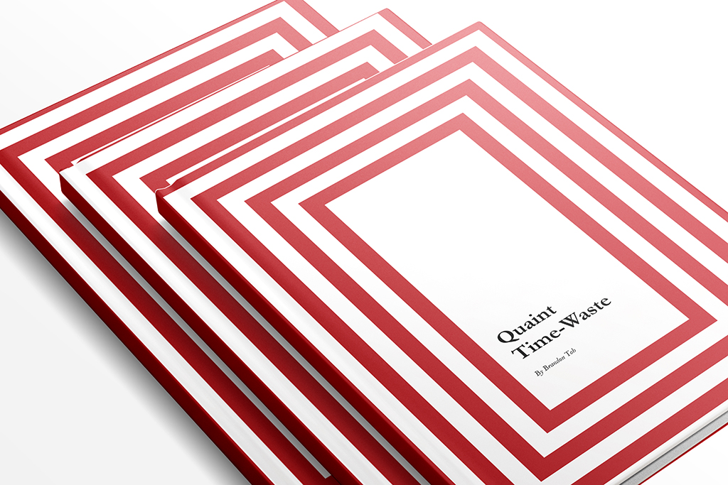
For this magic card trick book design, the concept was inspired by the idea of a cookbook, but reimagined for magic. Just like a cookbook guides readers through recipes step by step, this book needed to guide readers through card tricks in a clear, organised and visually engaging way.
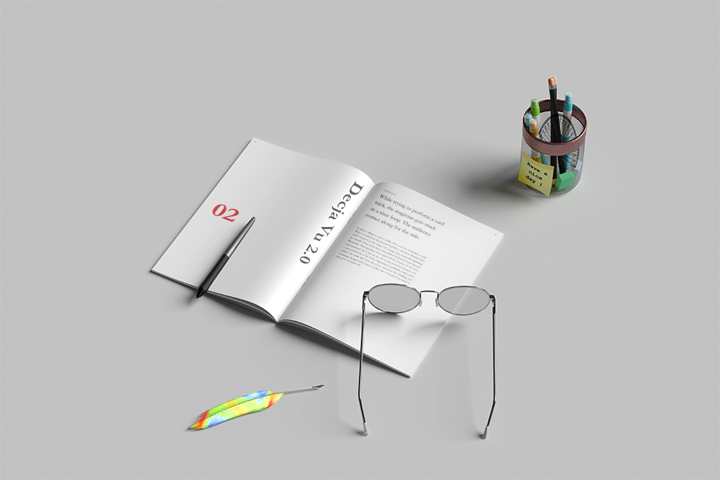
The book cover features an abstract visual inspired by a deck of cards, giving the design a bold and graphic look while still connecting directly to the subject of card magic. Inside, the layout was kept clean and readable, with carefully selected fonts that make the instructions easy to follow without losing the editorial feel.
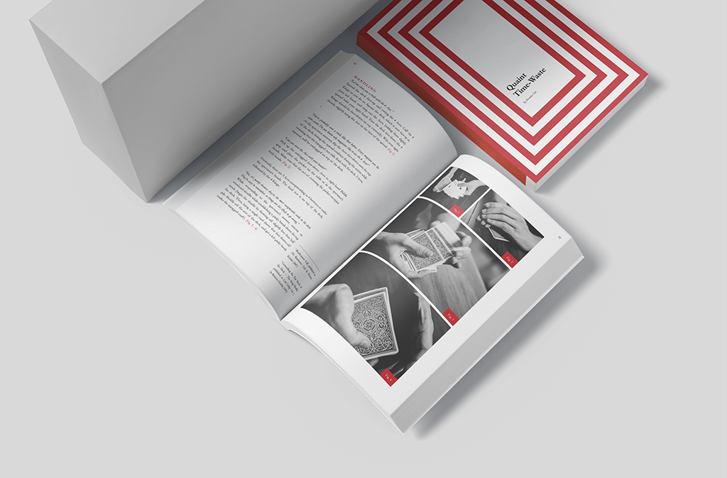
A red accent colour was used throughout the magic card trick book design to highlight important details and add visual energy to the mostly black-and-white layout. The chapter dividers were designed with bold typography and strong placement, making each new section feel clear, intentional and visually distinct.