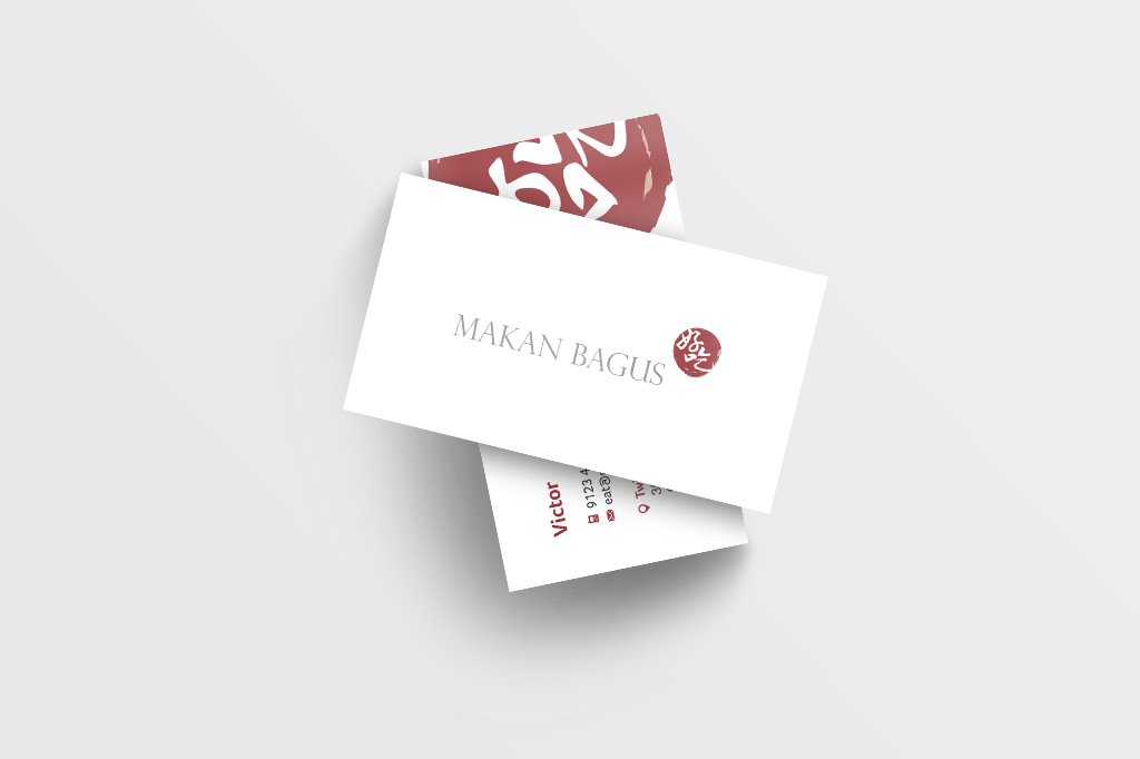
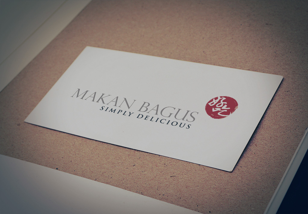
Looking for name card and logo design that strikes the perfect balance between tradition and modern appeal? That was the creative direction behind the branding for Makan Bagus, a local Singapore “zi char” (stir-fry) restaurant serving classic dishes in a more refined setting.
Makan Bagus approached me to create a fresh brand identity from the ground up. As a new entrant in the competitive F&B scene, they wanted a logo and name card that captured their roots in traditional Singaporean cuisine, while also appealing to a slightly more upscale dining audience.
Inspired by heritage, I designed a logo that takes cues from old-school ink stamp motifs—rounded, textured, and nostalgic. This visual language immediately communicates authenticity and familiarity, reminding diners of the rich hawker culture of Singapore.
However, because Makan Bagus is situated in a restaurant environment (not a typical coffee shop setting), they wanted a look that felt more polished and premium. For their name card design, I created a clean, minimalist layout with modern typography and generous white space. The result is a brand identity that feels elevated yet grounded—celebrating local flavours while catering to a more refined clientele.
This project shows how thoughtful name card and logo design can shape customer perception and help differentiate a brand in a saturated food market.
Ready to elevate your F&B branding? Let’s collaborate on a name card and logo design that truly reflects your business.


