
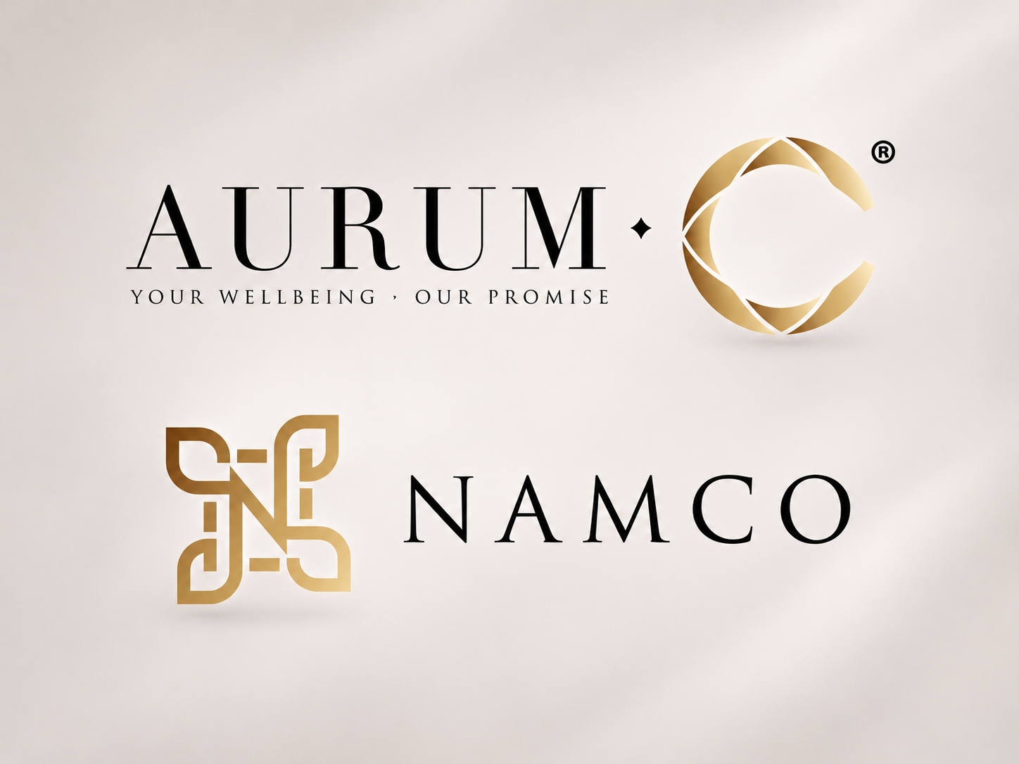
Namco had already been operating for some time, but they had never really developed a proper brand identity for themselves.
As the business grew and more activities came in, they felt it was time to make everything look more established and professional — starting with the logo, name card and website.
Namco acts as the parent company, housing different business interests including real estate and food and beverage. At the time, however, much of the client’s focus was on the nutrition side of the business, where they distribute health supplements and related products.
They wanted the overall branding to feel premium and credible. The idea was to show that they were serious about health and the quality of the products they carried, rather than coming across as another low-cost supplement distributor.
Designing Two Brands as One Family
One of the more interesting parts of this project was that I was not designing Namco and Aurum-C separately.
Aurum-C is the more consumer-facing nutrition brand, while Namco is the parent company. The client wanted both identities to feel like they belonged to the same family, but still be able to stand on their own.
So instead of presenting three Namco logos followed by three unrelated Aurum-C logos, I developed the initial proposals as three paired directions.
Logo 1 for Namco was designed together with Logo 1 for Aurum-C.
Logo 2 was another complete direction.
Logo 3 was another.
The idea was to explore three different interpretations of what a premium brand could look like.
One direction leaned more elegant and refined. Another felt stronger and more corporate. The third moved towards something softer and more wellness-led.
Within each direction, Namco and Aurum-C shared certain visual cues such as typography, colour or overall tone, but they were still designed to suit their different roles.
This allowed the client to look beyond the individual logos and consider the personality of the two brands together.
Exploring Different Interpretations of Premium
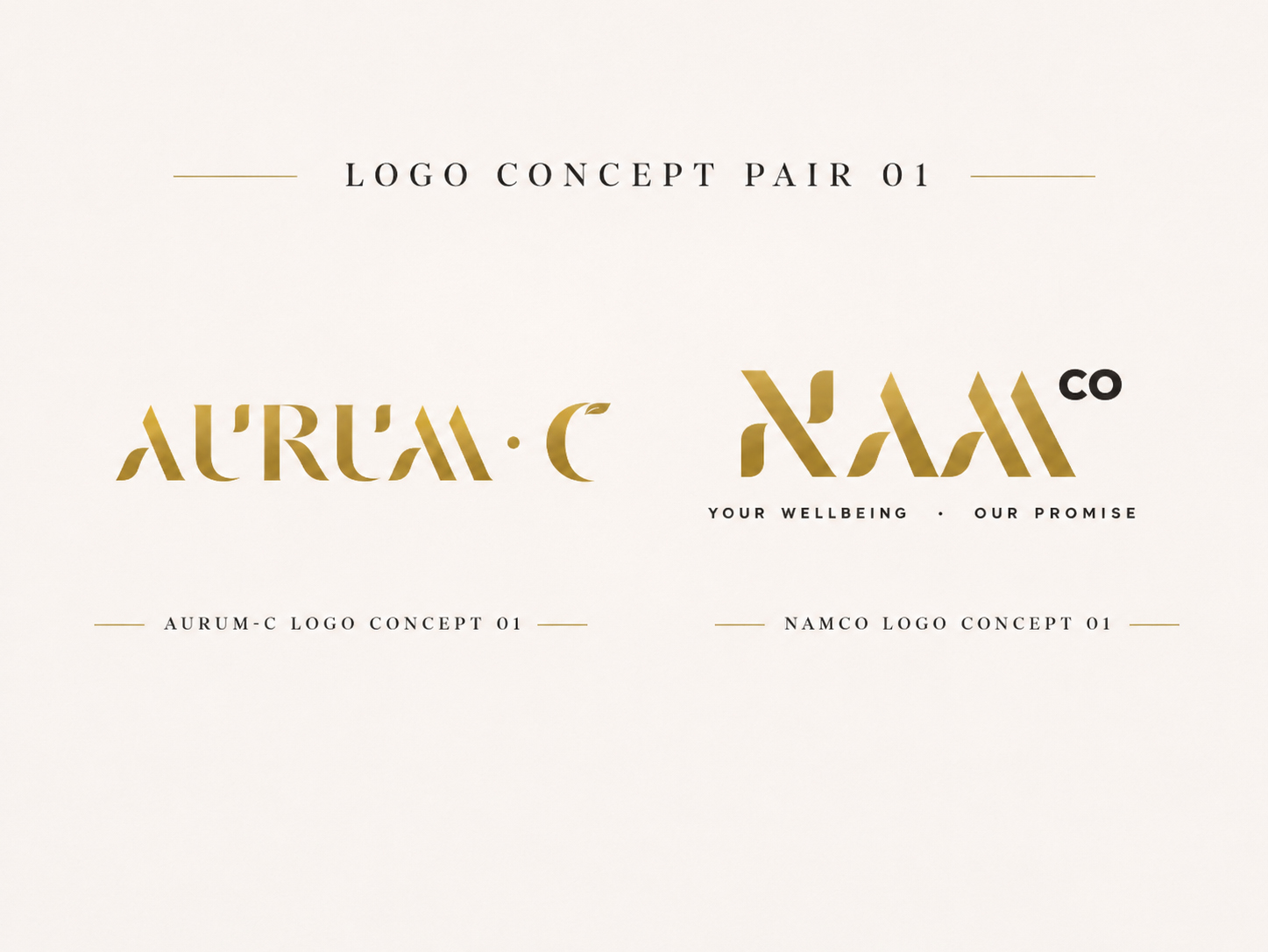
For one of the Namco directions, I explored a more elegant gold wordmark with a slightly futuristic feel. The idea was to communicate a more modern approach to health and wellbeing.
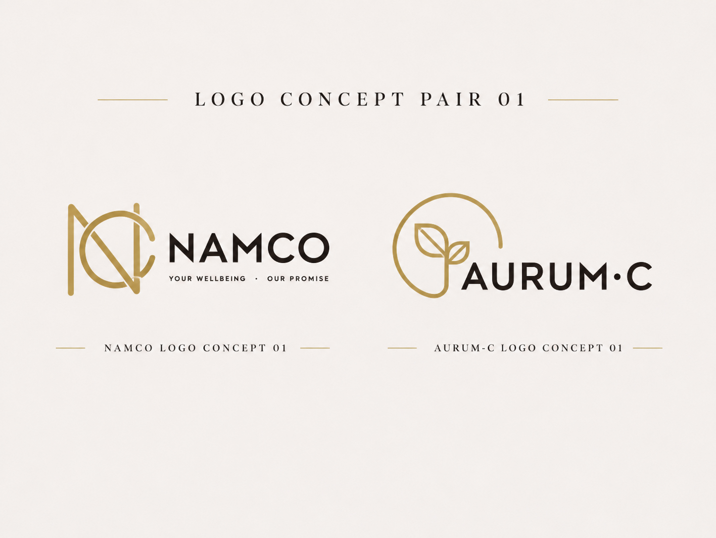
Another direction used a simple NC monogram with heavier typography, giving the parent company a stronger and more dependable corporate feel.
The third direction moved further towards health and wellbeing, using a floral-inspired treatment around the letter N with lighter typography to create something softer and more refined.
For Aurum-C, each concept followed the same general personality as its matching Namco proposal.
One direction deliberately used a related typographic style so that the two brands would immediately feel connected.
Another explored a simple stylised interpretation of cordyceps.
The direction that eventually stood out used the letter C as a faceted, jewel-like symbol.
I wanted it to feel almost like a diamond — something precious and refined — while also connecting the C back to cordyceps, one of the ingredients associated with the Aurum-C products.
The client was drawn to this sleeker and more refined direction, and that became the basis for the final identity system.
Making Namco and Aurum-C Feel Related
The challenge was to make the two brands feel connected without making them look identical.
Namco needed to work as a parent company across different business activities. Aurum-C, on the other hand, could be more expressive because it was the consumer-facing nutrition and wellness brand.
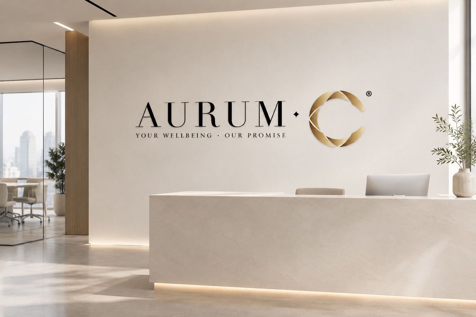
I used different serif typefaces and different symbols for each identity, while keeping the overall gold treatment consistent.
That helped create a visual relationship between the two brands without forcing them to behave in exactly the same way.
Namco remained more corporate and structured, while Aurum-C became more lifestyle-oriented and polished.
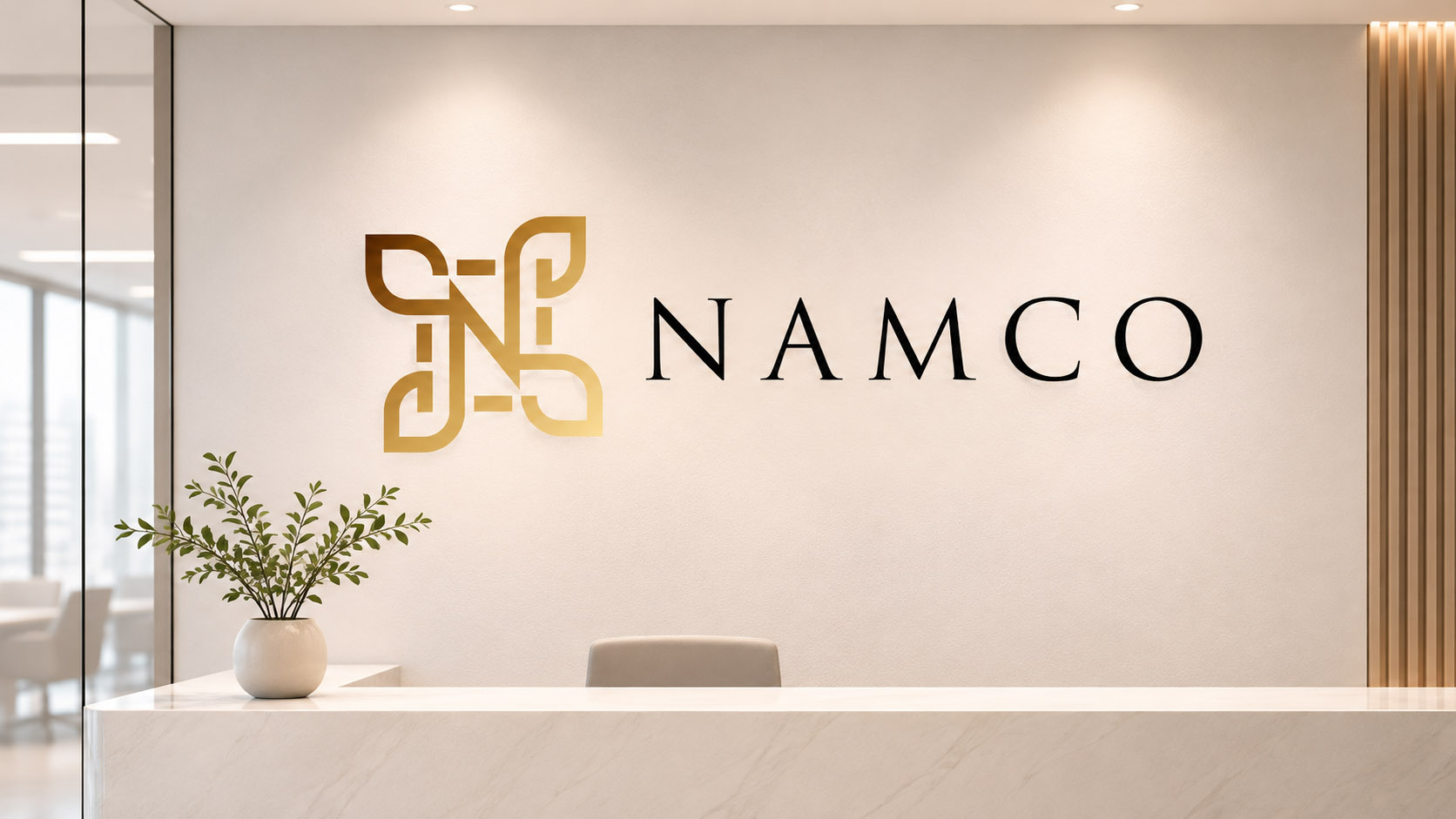
Finding the Right Gold
Gold was something the client felt quite strongly about.
Personally, I would probably have gone for something slightly lighter and more muted — perhaps a pale dusty yellow or a softer solid gold.
The client preferred a richer gold gradient because they felt it looked more premium and grand.
Rather than moving away from the direction they liked, I worked within that preference and adjusted the tones so the gold would still feel elegant without becoming too overpowering.
That is quite representative of how I normally work with clients.
Sometimes a client already knows the feeling they want, even if they cannot fully describe how to get there. My role is to understand what they are responding to and gently steer the direction so it still works visually and practically.
Refining Aurum-C
Because Aurum-C was more consumer-facing, the client wanted it to feel softer and slightly more feminine.
I adjusted the treatment to reduce some of the harsher elements while still keeping enough contrast in the typography.
For example, I did not want to make the text too light or washed out simply for the sake of making it softer. The identity still needed to remain clear when used at smaller sizes or printed on items such as name cards.
The tagline, “Your wellbeing, our promise,” also helped reinforce the softer wellness positioning of the brand.
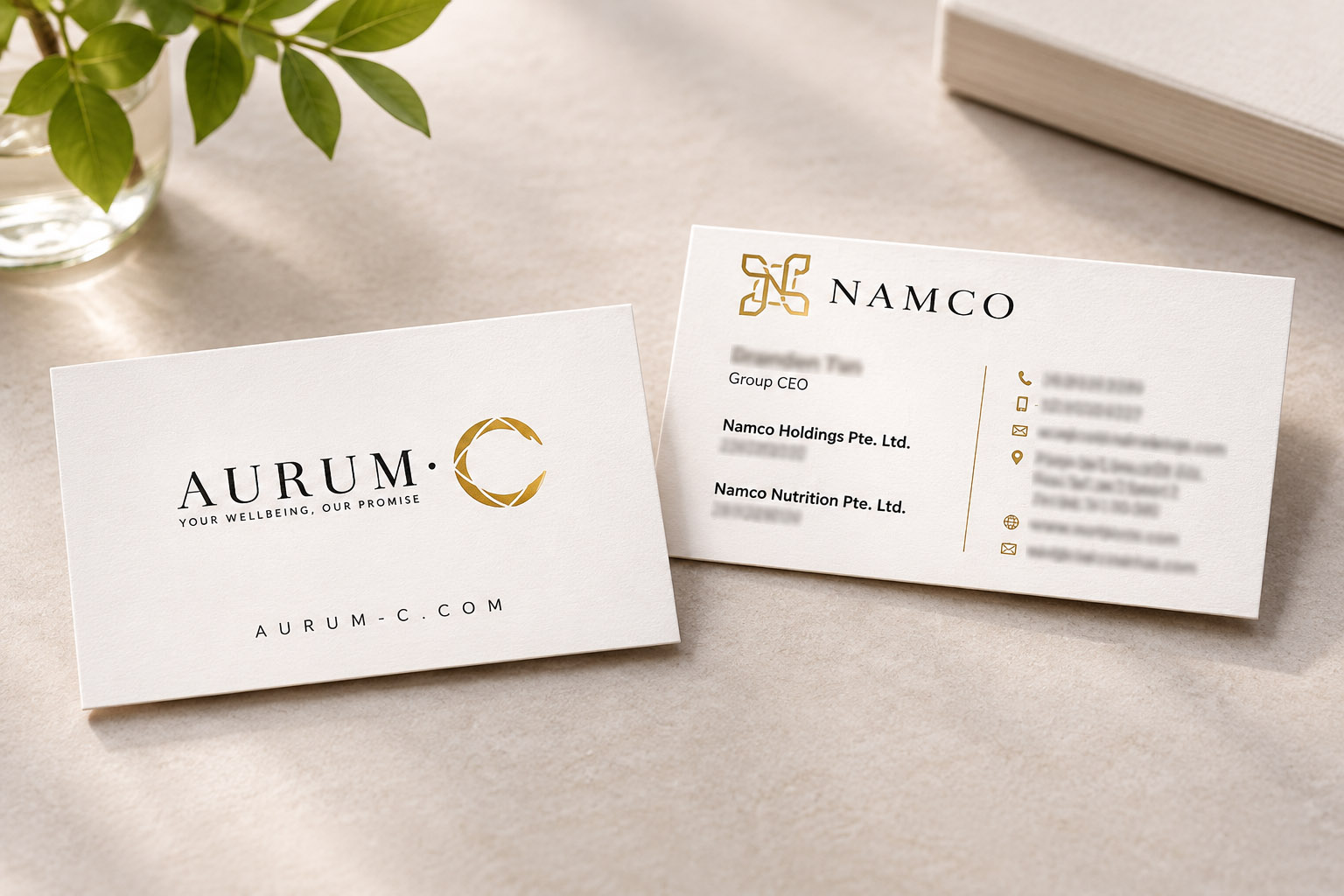
Extending the Brand Into the Name Card
Once the logos were established, I moved on to the name card.
Again, I did not want to present just one option. I explored different ways the identity could work in print.
The first direction was the most traditional — clean, white and straightforward, with the Namco and Aurum-C identities presented in a familiar corporate format.
The second direction was more contemporary. I experimented with a vertical format, rounded corners and a stronger use of gold to give the card a more current and distinctive feel.
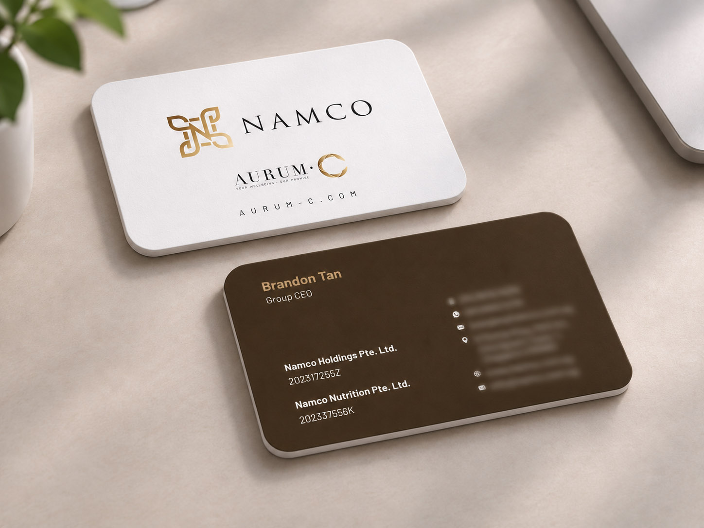
The third direction sat between the two, combining a cleaner traditional layout with more modern details such as rounded corners and a darker reverse.
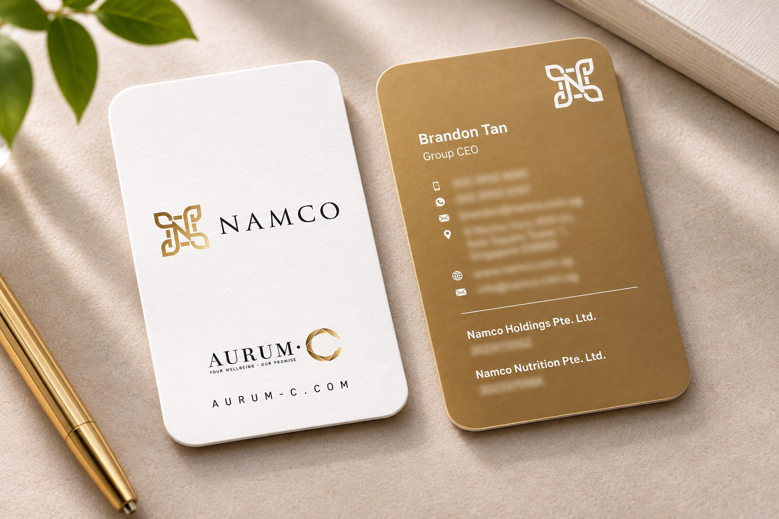
The client ultimately preferred something more traditional, but still wanted a touch of modernity.
So the final design became a middle ground between the directions.
I kept the clean white front, which made the Namco and Aurum-C logos easy to read and allowed both brands to sit together comfortably. I then introduced rounded corners and a darker brown reverse to give the card a more polished and contemporary finish without making it feel too trendy.
The name card also needed to show both Namco and Aurum-C because the client wanted their own customers and business contacts to understand that both brands sat within the same group.
This was another good example of how the project evolved through the client’s preferences. Rather than pushing the most modern option simply because it felt newer, the final solution took the part they were most comfortable with — a more traditional corporate card — and introduced just enough contemporary detail to make it feel current.
Taking the Brand Into the Websites
Once the visual identities and name card were established, the next step was translating the brands into their websites.
Again, I explored several visual directions before settling on the final look.
The Namco Website
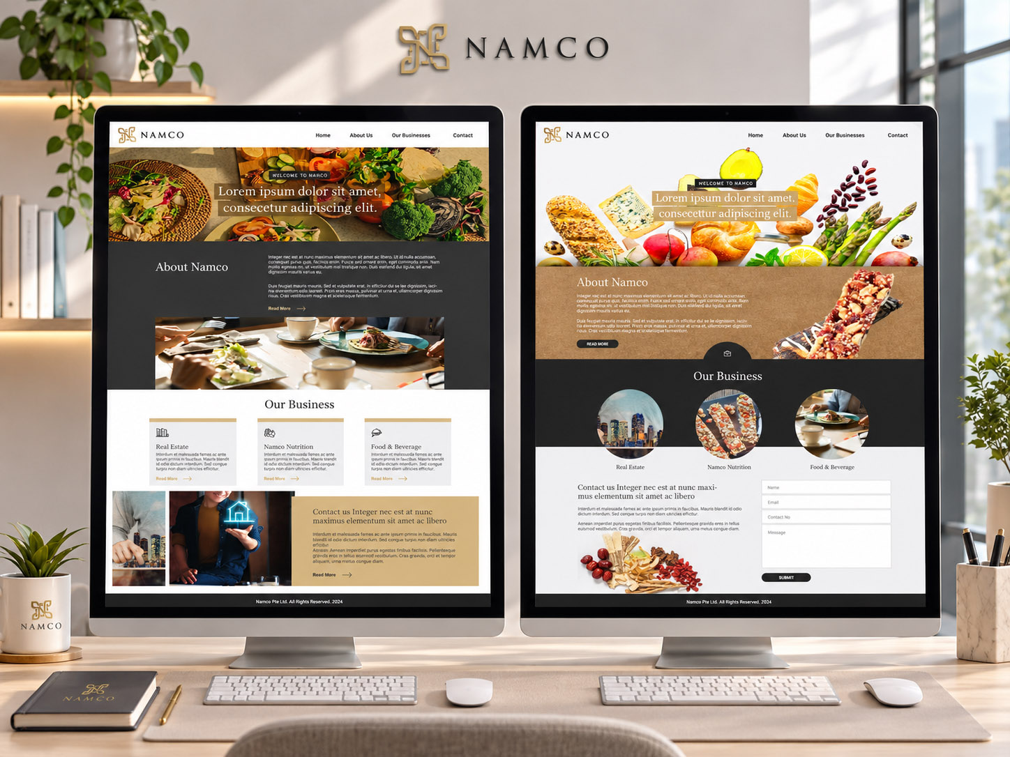
For Namco, I presented three homepage concepts that tested how far the parent brand could lean into lifestyle imagery while still feeling corporate.
One direction was cleaner and more editorial, using warmer imagery, a dark charcoal content section and a more structured presentation of the business areas.
Another was more expressive and contemporary, with larger food cut-outs, darker panels and more playful image shapes. It gave the site a stronger lifestyle feel, but also pushed the parent company further away from the more traditional corporate character the client preferred.
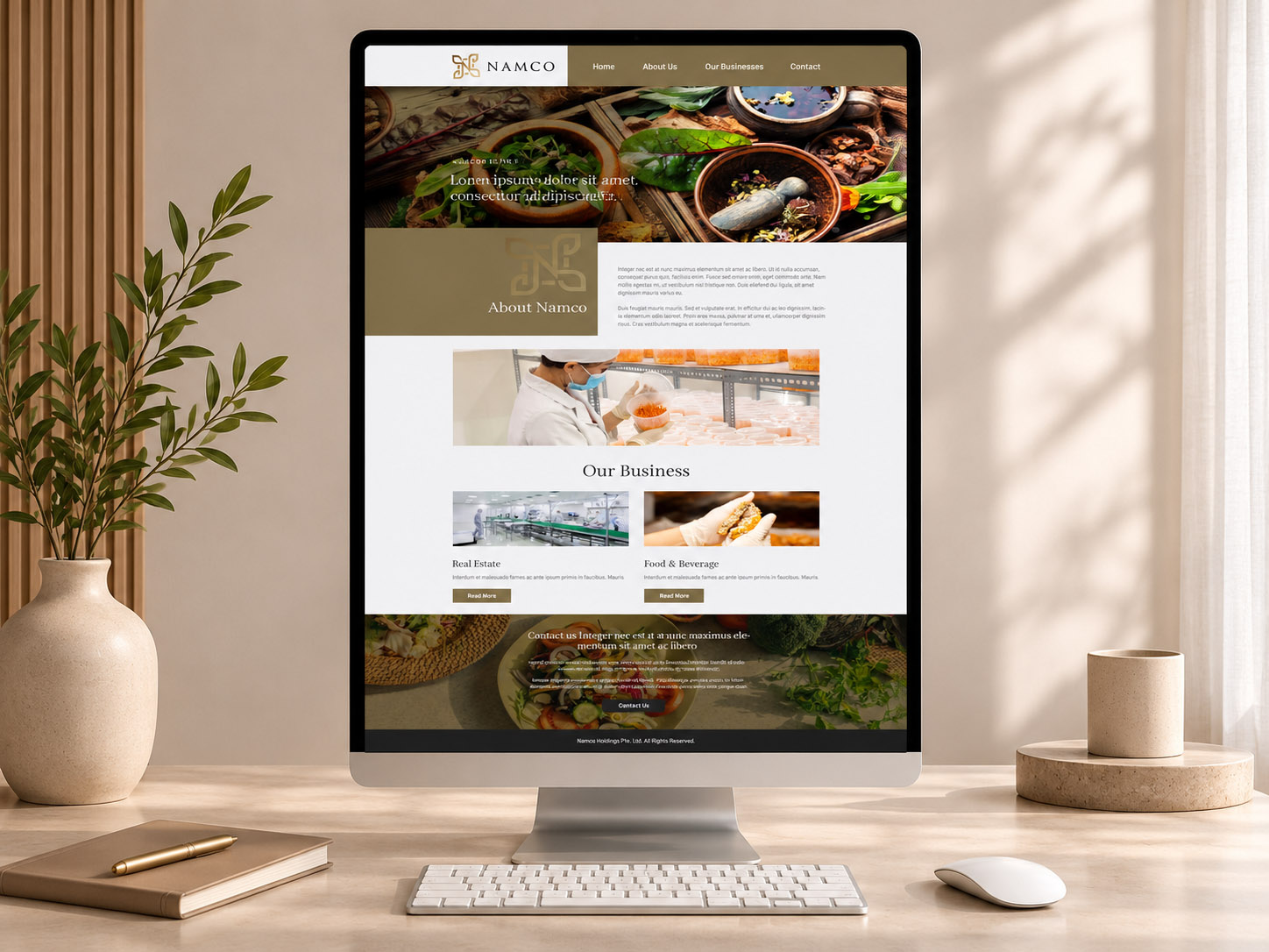
The final direction eventually sat closer to the client’s comfort zone: more structured, more corporate and easier to read as a parent-company website, while still retaining the premium visual cues from the wider brand system.
The Aurum-C Website
Aurum-C could go further into the lifestyle side of the branding.
I also presented three homepage directions there.
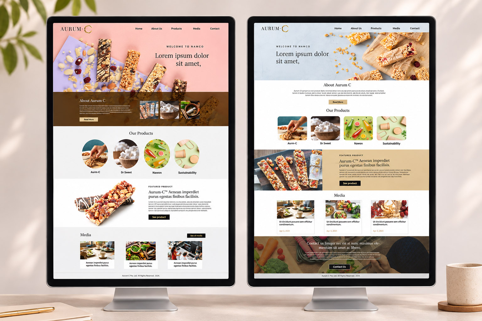
One was more colourful and expressive, using soft pink, lilac and warm brown tones together with more playful image shapes. It gave the brand a younger and slightly more contemporary personality.
Another was much lighter and quieter, with pale blue, generous white space and a more minimal editorial feel.
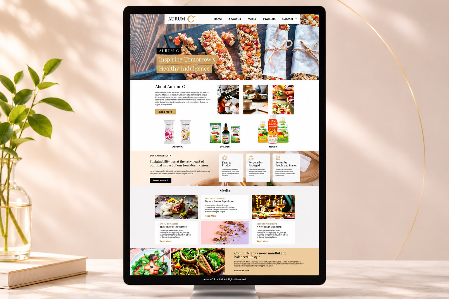
The chosen direction moved towards a warmer and more natural visual language. Beige and gold tones worked more comfortably with the approved identity, while food, wellness and ingredient imagery helped make the brand feel more relevant to the products themselves.
Two Brands, Two Different Jobs
Looking across both sets of website proposals, the website stage became another way of testing what “premium” meant for each brand.
Namco needed to feel established and corporate.
Aurum-C needed to feel softer, more lifestyle-led and more consumer-facing.
The two websites therefore did not need to look identical simply because they belonged to the same group.
The consistency came through the typography, gold palette and overall refined tone, while each site was allowed to develop its own personality according to what it needed to communicate.
That became an important part of this project:
Consistency did not mean making everything look the same.
It meant creating enough of a visual relationship that the parent company and consumer brand still felt connected, while allowing each one to speak properly to its own audience.
More Than Just Two Logos
Looking back, this project was less about designing two separate logos and more about building a small brand system.
The initial logo proposal stage allowed the client to see three different interpretations of what “premium” could mean.
The name card stage then tested how traditional or contemporary the corporate identity should feel.
The website stage pushed that exploration further again, showing how the same overall brand family could behave very differently depending on the audience and purpose.
From there, the challenge was to make Namco and Aurum-C feel like part of the same family while still allowing each brand to have its own personality.
Namco needed to feel established and corporate.
Aurum-C needed to feel more consumer-facing, wellness-focused and refined.
For me, the project is a good example of why branding goes beyond creating a logo.
It is about understanding how the different parts of a business relate to each other, deciding which visual elements should stay consistent, and knowing where each brand needs enough freedom to speak to its own audience.
It is also about listening to what the client is naturally drawn to and helping shape that into something that works.
In this case, they knew they wanted gold, they leaned towards a more traditional corporate presentation, and they wanted the consumer brand to feel softer and more premium.
My role was to take those preferences and gently steer them into a system that felt connected, balanced and usable across logo design, print and website design.


