
Annual reports and sustainability reports can look deceptively simple when they are finished. Beautiful cover. Clean typography. Nice charts. Everything sitting neatly where it should be.
What you do not see is the mountain of Word documents, photographs, spreadsheets, statistics, different chapters, different stakeholders and rounds of corrections sitting behind those pages.
AI has become part of my design workflow, and it can do some genuinely useful things. It can organise information, brainstorm ideas, help restructure content, generate visual references and catch details that I might otherwise spend time looking for manually.
But does that mean a 100- or 200-page annual report suddenly becomes quick and easy to produce? Not exactly. So I thought it would be interesting to walk through an actual report-design process with AI beside me – not to prove that one of us is better than the other, but to show where each of us is useful.
AI does not replace the design process. It joins the process.
AI: Give me the content, the previous reports and the brand guide. I can start pulling together a direction.
Me: You could. But if I simply hand everything over and say, “Design the report,” we are probably going to end up with something that looks finished before we have even understood the project.
That is the tempting way to use AI: give it a pile of information, ask for a design and hope the answer lands somewhere close to what the client wants. I have tried that before. It can produce something visually convincing very quickly, but that is not the same as understanding the brief.
First, We Need to Sort Out the Mountain
Report design starts long before I open InDesign. Usually, I first meet the client to understand what the report is about, what they are trying to communicate and how far along the content is.
If this is an existing annual or sustainability report, I will normally ask for previous editions too. I want to know what they liked, what they did not like, whether management or shareholders gave feedback, and whether there are parts of the old report they want to retain or move away from.
Then comes the content. With a large report, organisation is incredibly important. My smoothest projects are usually the ones where the client divides everything neatly into chapters. Chapter 1 has its Word document and corresponding images. Chapter 2 has the same. And ideally, there is one main person on the client side coordinating everything.
AI: This sounds like the kind of thing I can help with. If the folders are messy, I can inventory the files, group them by chapter, list the images and summarise what is inside each document.
Me: Yes – and that would save me from playing treasure hunt for six weeks.
That is genuinely useful. If I receive a large folder of material, AI can act a little like an admin assistant: tell me what files exist, which chapter they appear to belong to, and flag obvious duplicates or missing pieces.
But I still need to be involved, because organisation and approval are not the same thing. AI can tell me that there are three versions of a table; it cannot know which one the finance team approved unless that information is clearly provided. It also cannot know that someone emailed me a revised image five minutes ago unless I give it that update.
The problem is not simply finding a file. It is knowing whether I have the latest file, whether the photograph belongs to Chapter 3 or Chapter 5, whether Person A has already approved what Person B just replaced, and who I should ask when something does not make sense.
For something containing potentially hundreds of pages, having a clear workflow is not administration for administration’s sake. It is part of getting the design right.
AI can organise the mountain. The designer still needs to know what matters.
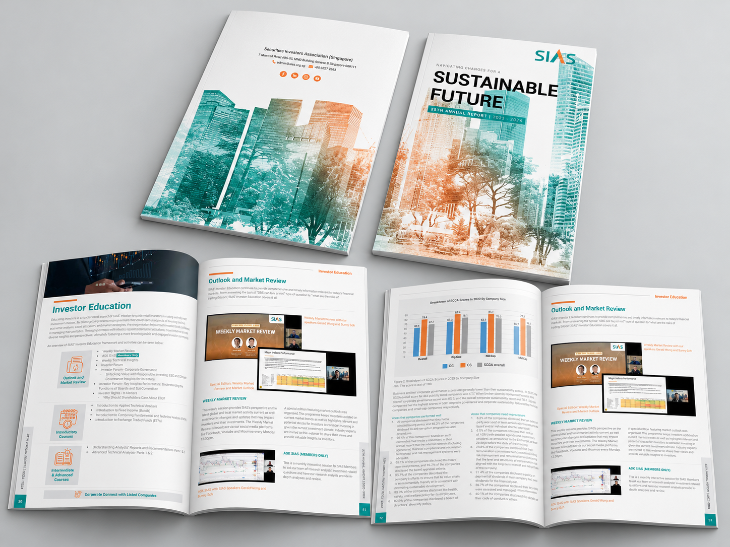
Can We Design First and Put the Content In Later?
AI: While I organise the material, could you start establishing the visual direction? We might be able to work on both things at the same time.
Me: To a certain extent, yes. This is where working together can help the process move in parallel – but there is still a limit.
I can establish a visual direction before every word is finalised. But a layout designed for 500 words is going to behave very differently when you suddenly give me several sections of text, three charts, four photographs and a table.
Without the actual content, I can demonstrate possibilities: two callouts here, a pull quote there, perhaps an infographic, maybe this is how a case study could look. But report design is not about creating pretty empty boxes and hoping the content conveniently fits inside them later.
The content shapes the design.
AI can help parallelise parts of the process, but it cannot remove the dependencies between content and layout. Sometimes it helps me get to a useful starting point faster; it does not make the content itself irrelevant.
AI can help me move faster in places — but the content still shapes the design.
Before Anything Else, I Look at the Brand
AI: If you give me the brand guide and previous publications, I can pull out the key visual rules – colours, typography, image style and recurring graphic elements.
Me: And that would actually save me some time. You can help me scan the rules; I still need to decide how they should behave in this particular report.
I will still look through the client’s brand guide for typography, colours, illustration styles, photography and other visual rules.
The report does not necessarily need to look exactly like their website or corporate brochure. In fact, I usually want the publication to have some personality of its own. But it should still feel unmistakably like it belongs to the same organisation.
AI can identify the rules. It can tell me the primary colours, the typefaces and recurring graphic motifs. But extracting the rules and deciding how to use them are two different things.
How much of the primary colour is too much? Should this report feel more editorial than last year’s? Does a graphic motif still work when there are 15 charts on one spread? Those are decisions I still need to make in context.
Some clients know exactly what they want. I have even had clients use AI to generate moodboards showing me roughly what they have in mind, and I actually find that useful.
AI: So I helped before I even joined your side of the project.
Me: Exactly. The moodboard gives us a language to talk about. It is the conversation starter, not the finished design.
AI is useful for opening up possibilities. The designer decides which possibilities are worth pursuing.
The Three Proposals
I normally present three initial design directions. Each will usually include a cover, two sample inside pages and a back cover. That gives the client enough information to understand how the direction could translate into a publication without me designing an entire report unnecessarily.
If the client already knows roughly what they want, my three proposals may stay within the same overall visual direction while exploring things like hero imagery, colour treatment, typography or placement.
If the client is much less certain – particularly if this is their first major publication – I may deliberately make the three proposals quite different.
That gives us something concrete to discuss. Clients often find it much easier to react to something they can see than to describe an imaginary report before anything exists.
After years of doing this, I have also learnt to listen for little clues during the initial briefing: what the client repeatedly mentions, what they respond positively to and what they are clearly trying to move away from. That does not mean I can read minds. It just means I have survived enough design briefs to recognise a few patterns.
Me: This is another point where you could help. If the client gives me very little visual direction, could you help me widen the starting pool before I narrow it down?
AI: Yes. I can analyse the brief, identify recurring themes, suggest visual territories, research references and build moodboard directions for you to react to. I can also point out contrasts between directions – for example, editorial versus corporate, image-led versus infographic-led, or restrained versus more expressive.
Me: That is useful because it means I am not starting from a completely blank page. But I would still decide which ideas are worth pursuing, how they suit the client’s industry and audience, and how those ideas become an actual report design.
I still cannot read the client’s mind – but having AI beside me gives me a few more ways to test what might be hiding in there.
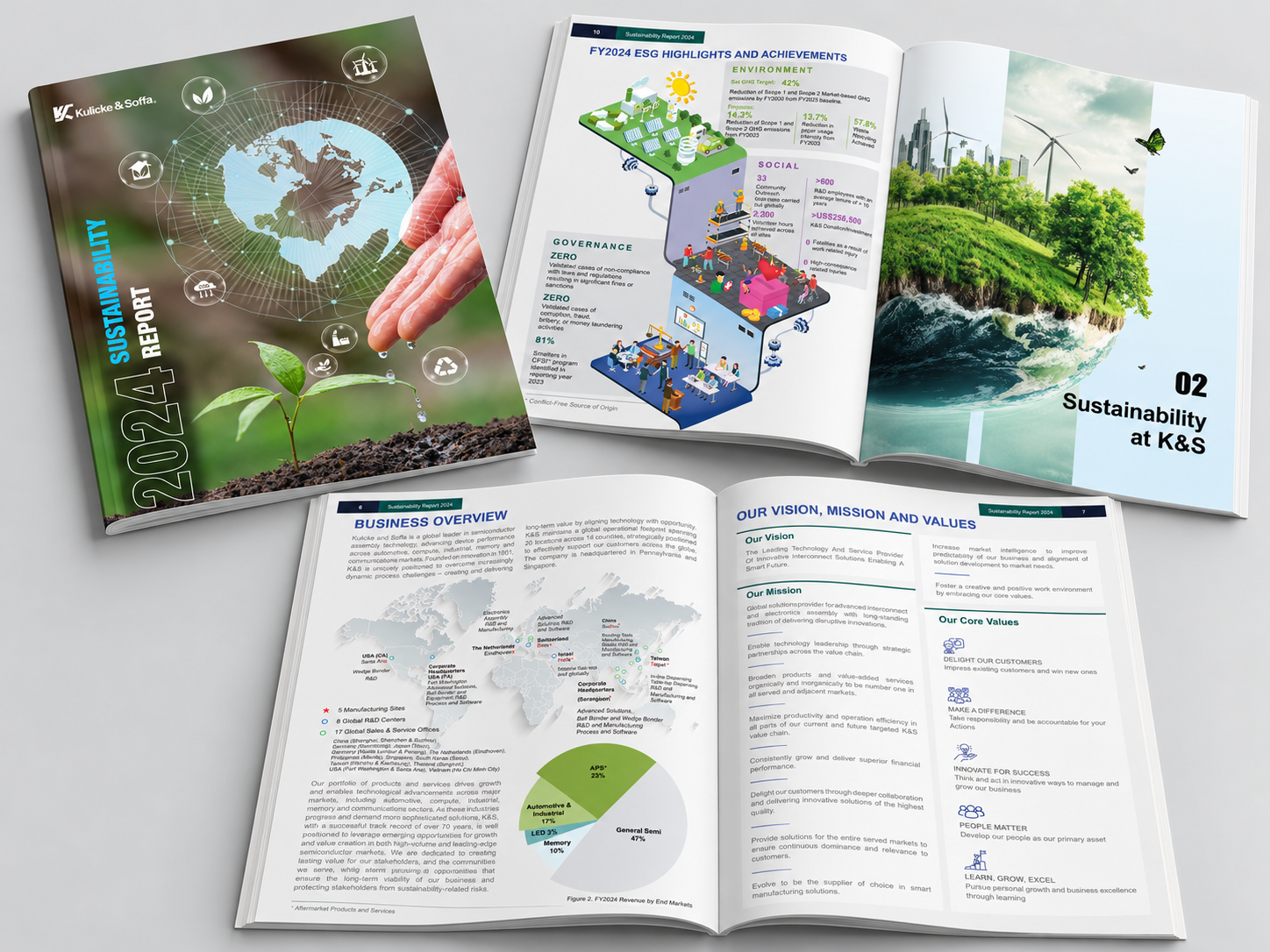
The Client Picks One. Are We Ready to Design 200 Pages?
AI: We have the chosen direction now. Do we roll it out across the whole report?
Me: Not yet.
This is probably one of the most important stages. Once the client chooses a direction, particularly with a new client, I will usually develop several additional page types or sometimes an entire chapter before rolling it out across the whole report.
A nice cover proves that I can design a nice cover. It does not prove that the design can handle long-form text, case studies, photographs, tables, charts, pull quotes, highlight pages, captions, multiple heading levels and everything else the publication will throw at it.
This is where we test whether the design system actually works.
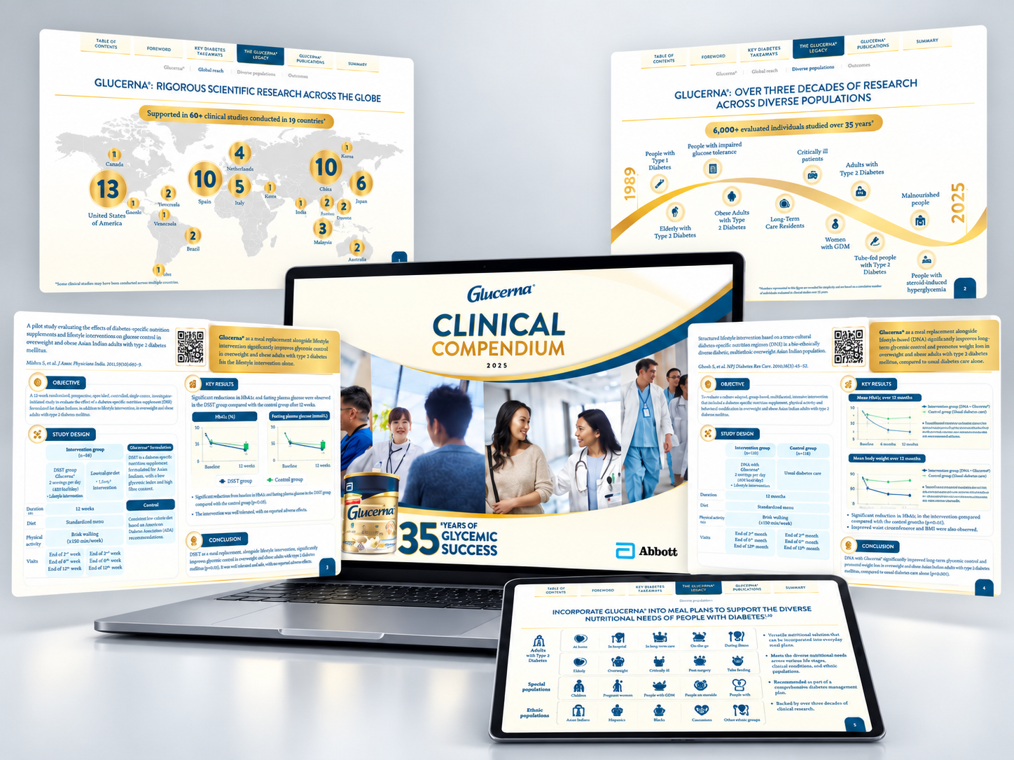
The Tiny Font Problem That Becomes an 80-Page Problem
I once worked on a sustainability report with many levels of text hierarchy. There was body copy, subheadings, sub-subheadings, supporting text and callout boxes.
At the beginning, even the client and I did not know exactly how many hierarchy levels we would eventually need because the content was not completely finished.
AI: I could suggest a type hierarchy based on the content you have now.
Me: You could – and that gives me a useful starting point. But this is where the real pages need to answer back.
A hierarchy that works perfectly on Page 12 might fall apart on Page 87 when a new level of information suddenly appears.
Instead of trying to perfect everything immediately, I created an initial draft with the real content first. Once enough pages existed, I could see what the actual hierarchy needed to be. Then I established suitable font sizes and colours for each level.
I also asked the client to reflect the same hierarchy in their Word documents. So when new content arrived, both sides understood: this is the title, this is the subtitle, this is the sub-subtitle.
It sounds like a tiny thing. Across a long report, it saves an enormous amount of unnecessary resizing, rearranging and confusion later.
This is a good example of why AI does not necessarily make the project shorter. It may help me reach a starting point faster, but I still have to test, adjust and refine that system against the actual publication.
What AI can do is give me more possibilities to test in the same amount of time. It does not automatically make the process shorter. It can make the process richer.
AI does not automatically make the process shorter. It can make the process richer.
When a Wall of Text Really Is a Wall
By this point, the report system may be working well – and then a page arrives with twice as much copy as everything around it.
AI: I can summarise the section or suggest a shorter infographic version.
Me: Yes – and this is somewhere I find you genuinely useful.
I am not the client’s copywriter, so I should not quietly rewrite approved corporate content. But if a page has become a wall of text, I can use AI to help me demonstrate what a shorter version could look like.
I might generate a condensed draft or turn the main points into an infographic structure, design the page around that, and show it to the client.
Then I can say: “This is the amount and structure of content I think would work better visually. I have used AI to create a working draft – please review and rewrite it in your own approved wording.”
AI helps me communicate the design solution. The client still owns the content.
AI can help me show the idea more clearly — but it does not take over the client’s voice or the designer’s judgement.
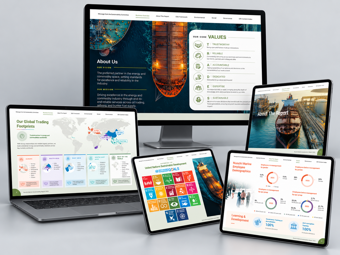
Sometimes the right design solution is not another decorative graphic. It is simply making the information easier to absorb.
Then Comes the 200-Page Reality
Once the main visual system and page types are approved, I can start moving through the report chapter by chapter.
For large reports, I usually work in weekly batches.
AI: Could I help keep track of the batches while you design them? For example, summarise outstanding comments or flag repeated changes across chapters?
Me: Yes – that is much more useful than waiting until Page 200 and trying to review everything at once.
If it is a 200-page publication, I can send whatever has been completed that week to the client. While they review Batch 1, I work on Batch 2.
If another department is still writing Chapter 6, that is okay. Give me Chapters 1-5 first and the work can continue concurrently.
This keeps a very large project moving instead of creating one enormous review exercise at the end. AI can help with the tracking and organisation around that workflow, but the review still depends on real people making decisions and approving changes.
Then Comes the Not-So-Glamorous Part
AI: The design is almost there. What can I help check?
Me: Quite a lot, actually.
Now come the revisions, updated figures, proofreading, corrections and last-minute content changes.
With an annual report or sustainability report, accuracy matters just as much as appearance. The client ultimately remains responsible for approving the copy, figures and factual information. I will do my best to make sure everything supplied to me is transferred accurately, but both sides still need to check the final document carefully.
Me: At this stage, you can probably help me more than InDesign’s spellcheck.
AI: I can flag spelling, grammar, inconsistent terminology, duplicated words, inconsistent headings and differences in formatting or naming.
Me: Perfect. That gives us another layer of checking. But you are not signing off the revenue figures.
AI: Fair. Those still go back to the client.
This is also why I do not treat factual and copy corrections in quite the same way as design revisions. It does not mean the client can redesign the report indefinitely. It means that within the agreed production period, we need enough flexibility to make sure the information being published is actually correct.
So, Where Does AI Actually Fit Into My Report Workflow?
AI: Quite a few places, apparently.
Me: More than I initially expected – just not always in the places people assume.
AI can help me organise and summarise large amounts of supplied content, analyse previous reports and brand guidelines, brainstorm visual directions, research references and moodboard ideas, explore infographic structures, produce working drafts of condensed copy for client review, help generate or refine certain imagery, flag inconsistencies and proofread, and take some repetitive work off my hands.
What it does not remove is the need to understand the client, decide which suggestions are actually appropriate, test the design against real content and make hundreds of interconnected decisions across the publication.
The real advantage is not ‘AI instead of designer’. It is designer + AI + better decisions.
From a Mountain of Content to a Finished Report
Annual report and sustainability report design is very different from designing a short brochure. There is much more information, coordination and structure involved.
And sometimes the best design decision is not adding more design at all.
It can be a generous area of white space that gives the reader somewhere to breathe. A small icon that draws attention to one important number. A chart replacing a difficult paragraph. Or simply knowing when not to add another colour, graphic or decoration.
Every visual element should have a reason to be there.
So has AI made designing a 200-page annual report instant? Definitely not.
I still need to understand the client, organise an evolving project, make design decisions, test the system, respond to feedback and make sure everything works together from Page 1 to Page 200.
In fact, sometimes AI gives me more possibilities to explore, which means there can be more decisions to make rather than fewer. But that is not necessarily a bad thing.
AI can help me organise the mountain before I start climbing it. It can give me ideas I might not have considered, help me communicate a visual solution, catch mistakes and take some repetitive work off my hands.
It does not automatically make the design process shorter. It can make the process richer – and, when we use it properly, help us arrive at a better result.
Using AI is not about skipping the process. It is about getting more out of the process.
So perhaps it is not really me versus AI after all. It is me, AI, my client – and one very large report that we need to get across the finish line together.


