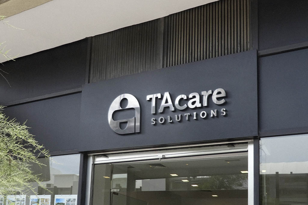
Engaging with TA Care Solutions on their logo design project was a compelling venture. Tasked with visually encapsulating their commitment to healthcare for the elderly, I embarked on a creative journey that seamlessly merged recognizability and symbolism.
Given the industry focus, the incorporation of a red cross was an intuitive choice, instantly evoking healthcare connotations. However, the true artistry emerged in fashioning the cross to subtly transform into a figure holding a cane, skillfully representing the targeted demographic – the elderly. This dual symbolism not only communicated the essence of healthcare but also resonated with TA Care’s specific mission.


